Why “human” computer vision matters in real products
You’ve seen it: a model that looks strong in validation quietly falls apart in the product. It tags a dog as “cat” under warm indoor lighting, misses a wheelchair because the angle is unusual, or fires a safety alert because a shadow resembles a person. Users don’t experience “accuracy”; they experience inconsistent behavior, confusing outputs, and friction that slows them down or makes them ignore the feature entirely.
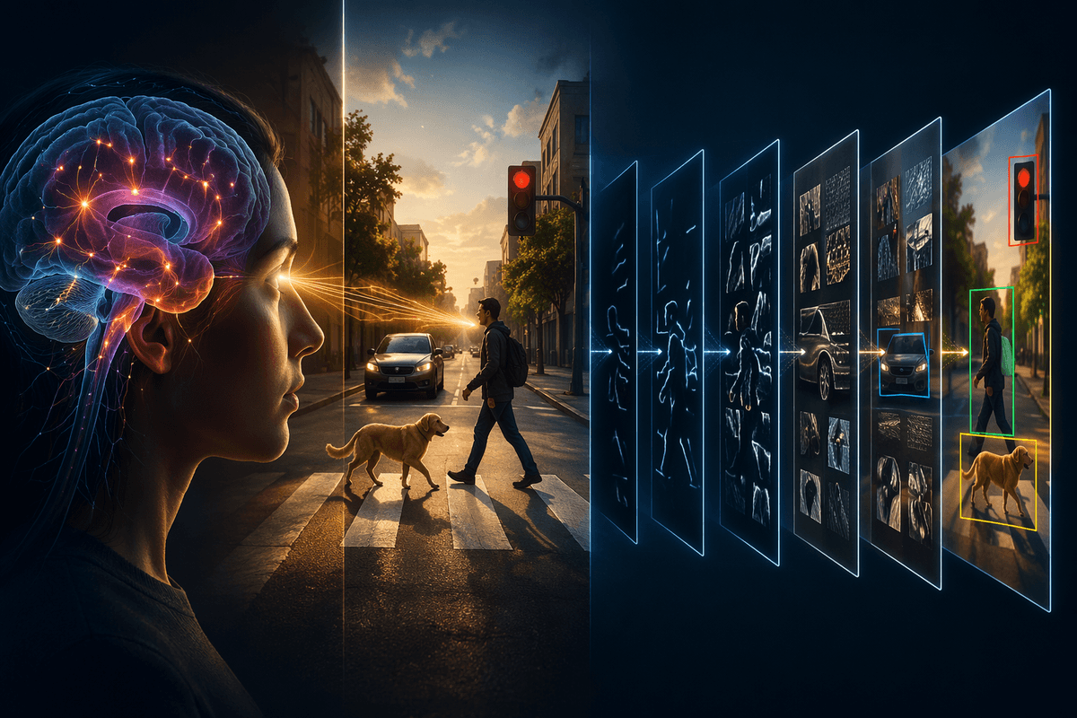
“More human” computer vision usually means something narrower and more actionable than “more intelligent.” It means behaving predictably across everyday variation, handling ambiguity the way a reasonable person would (or clearly admitting it can’t), and producing outputs people can use to decide what to do next. In real products, that also includes constraints humans notice immediately: latency on-device, privacy expectations, and the cost of being wrong in the specific workflow you’re supporting.
When teams define “human” in terms of the user’s task—what counts as a miss, what uncertainty looks like, what a safe fallback is—they can choose metrics and designs that match real stakes. That framing turns debates about model choice into concrete questions: which errors are acceptable, which are harmful, and how the interface should respond when the model is unsure.
Start with the human task, not the dataset
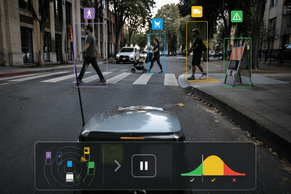
A common trap is letting the available dataset define the product. If your labels are “person / not person,” you end up shipping a feature that behaves like a binary gate—even when the real task is “should I slow down,” “is this a delivery,” or “is this item acceptable to scan.” Humans don’t make those calls from a label set; they use context, tolerance for mistakes, and a sense of when to ask for a second look.
Write the task as a decision inside a workflow, with a clear cost for each kind of error. A warehouse picker might prefer “flag anything uncertain” because missing a hazard is expensive; a photo app might prefer “do nothing unless confident” because false alarms feel spammy. Then derive what the model should output (maybe a score, category plus reason, or “unknown”), what counts as success (time saved, fewer reversals, fewer escalations), and what data you actually need.
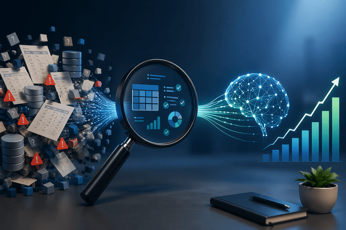
That often forces practical constraints into the definition. Capturing examples from real lighting, camera angles, and devices costs time and money, and labeling can be inconsistent if the “right answer” depends on policy or context. Treat those as product requirements, not data cleanup, and you’ll design the system around the human job it’s meant to support.
Where computer vision feels inhuman: common failure patterns
A familiar frustration is watching a vision feature behave like it has “tunnel vision.” It nails the easy frames, then fails on small, normal shifts: backlighting, motion blur, seasonal clothing, a different phone camera, a dirty lens. The result feels inhuman because people expect graceful degradation—roughly right, or at least consistently cautious—not a sharp drop from “confident” to “wrong” when the scene changes a little.
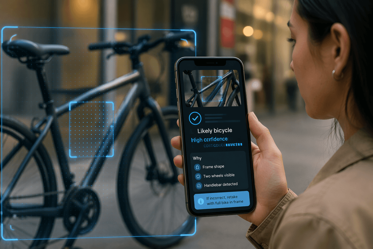
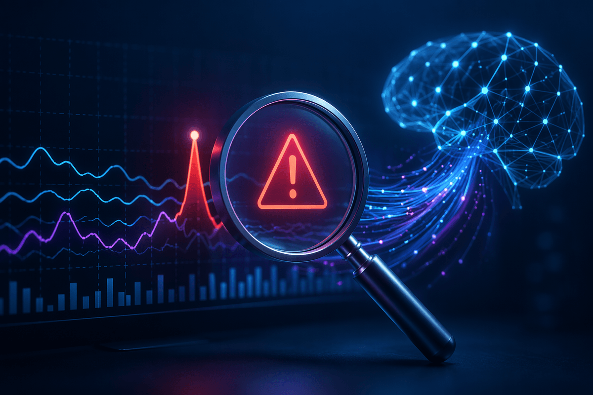
Another pattern is misplaced certainty. Models often output clean categories even when the input is ambiguous, occluded, or outside the training world. Humans hedge (“not sure,” “maybe that’s a stroller”), but a model may confidently pick “bicycle” and trigger an alert. This gets worse when the product treats scores as truth, rounding away nuance, or when thresholds were tuned on a tidy test set rather than your actual camera feeds.
Finally, systems can feel inhuman when they miss the social and physical context users rely on: confusing reflections for objects, failing on darker skin tones or assistive devices, or ignoring “near misses” that matter in safety workflows. Fixing these isn’t just modeling; it usually requires new data collection, better labels, and time-consuming evaluation across environments your team doesn’t control.
Make outputs legible: explanations users can actually act on
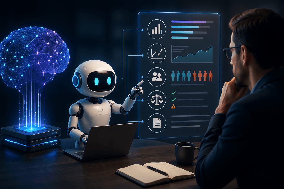
The user can’t act on “0.83” unless they know what it means for their job. Legible outputs translate model signals into the decision the interface is asking them to make: “Likely damaged—review before shipping,” “ID unreadable—try moving closer,” or “Person detected near the loading zone—slow down.” When the model is wrong, users should be able to see why it happened in terms they recognize (glare, occlusion, similar-looking items), not a generic error.
The most useful explanations are constrained and operational. Show the few features that change the next step: a highlighted region, a short reason code, and a clear confidence band tied to outcomes. Avoid heatmaps that look scientific but don’t map to action. There’s also a real cost: adding explanations can increase latency, clutter the UI, and create compliance risk if you expose sensitive attributes. Treat “explainability” as a product surface with budgets, not a free add-on.
A practical test is whether a first-time user can improve the input in one try. If the system can’t guide capture (“hold steady,” “better lighting,” “include the whole label”), prefer a simpler output that routes to manual review. Clarity beats cleverness when the point is trust.
Design for uncertainty: abstain, ask, or fall back safely
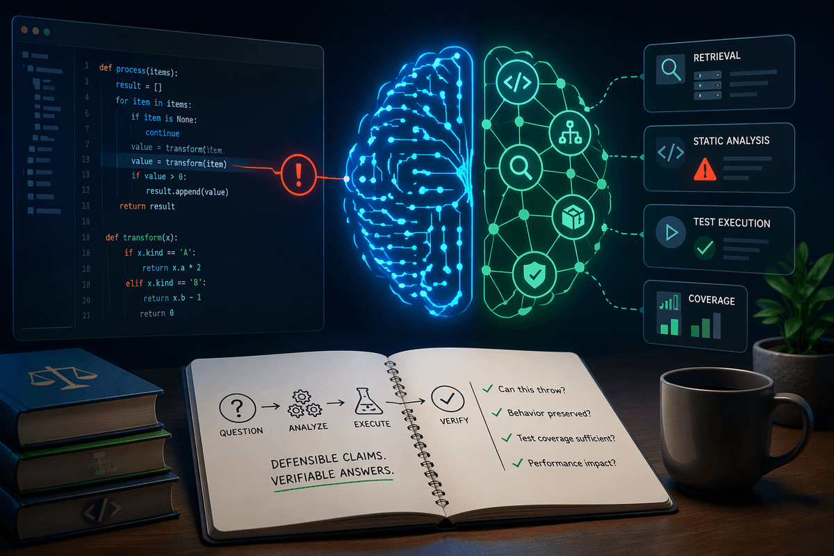
A vision system that always answers will eventually answer wrong in a way users can’t anticipate. Treat uncertainty as a first-class product state: “I don’t know” is often the most human output when the frame is blurry, the object is partially hidden, or the scene looks unlike what you trained on. Practically, that means calibrating confidence so a score corresponds to real-world error rates, and defining thresholds based on workflow cost, not leaderboard accuracy.
When the model is unsure, you have three useful moves. Abstain: return “unknown” and route to manual review, which costs labor and adds queue time but prevents silent failures. Ask: prompt the user for one targeted improvement—move closer, change angle, retake with flash—so the system can recover without guesswork. Fall back: use a safer, simpler behavior (e.g., conservative alerting, disabling automation, or relying on non-visual signals) so the product degrades gracefully instead of flipping into confident nonsense.
Ship these behaviors explicitly: log abstentions, measure retry success, and monitor whether uncertainty clusters by device, environment, or user group. If “unknown” becomes common, it’s usually a data and capture-design problem, not something to hide.
Fairness and inclusivity: testing beyond the average case
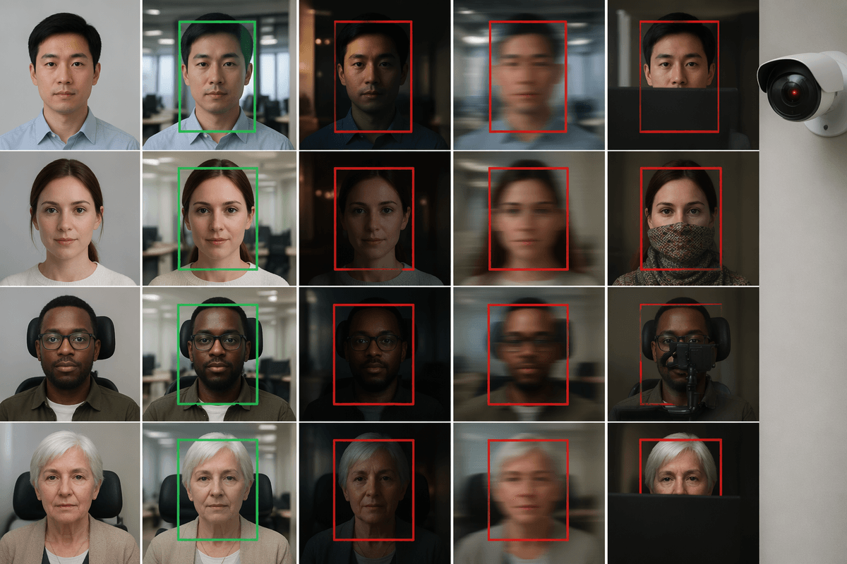
The typical “good overall” model can still be unfair in the only moments that matter: it reads IDs reliably on glossy cards but fails on matte finishes, detects faces under office lighting but drops under low light, or misclassifies assistive devices because they’re rare in training. Users experience this as arbitrary treatment—some people get smooth automation, others get retries, manual review, or false flags. If the feature is part of access, safety, or compliance, those gaps turn into real harm fast.
Testing beyond the average case starts with slicing evaluation by factors your product actually sees: skin tone and age ranges for face-related features, head coverings and hairstyles, mobility aids, camera type, lighting, weather, motion blur, and occlusion. Build a “must-pass” set that mirrors your workflow, not just a benchmark. The practical constraint is cost: collecting representative data, getting consistent labels, and handling privacy approvals can take longer than model training.
When you find gaps, resist the reflex to “just add data” without changing the process. Update labeling guidelines, add targeted capture prompts, and track parity metrics (error rates, abstention rates, time-to-complete) by group and context so improvements don’t simply shift the pain elsewhere.
From lab to life: monitoring, feedback loops, and updates
After launch, the distribution shifts almost immediately: new phone cameras, OS updates that change image processing, seasonal lighting, different store layouts, and users finding “creative” ways to aim the camera. If you only watch aggregate accuracy, you’ll miss the early warning signs. Track product-facing indicators that map to experience: abstention rate, retries per task, time-to-complete, override rate, and which fallbacks trigger most. Set up drift checks on input quality (blur, exposure, crop rate) and on embedding or score distributions so you can spot “same UI, different world” problems quickly.
Feedback loops need structure or they turn into noisy anecdotes. Make it easy to report a bad result with the frame, the model output, and the user’s correction, then route it into a triage queue with clear label rules. Budget for review labor, privacy filtering, and storage; those costs are usually higher than teams expect. Ship updates behind versioning and A/B gates, with rollback paths, because “better overall” can still break a critical slice. Treat monitoring as part of the feature, not a separate ops project.
A practical checklist for making vision feel human
Before you ship, write a one-sentence “human” spec: the user decision, the worst plausible error, and the acceptable fallback. Define outputs that match the workflow (label, score band, “unknown,” and a reason code), then test capture guidance with first-time users until retries drop. Calibrate thresholds on real feeds, and require a must-pass set sliced by devices, lighting, occlusion, and user groups; track parity in error, abstention, and time-to-complete.
Operationalize it: log uncertainty states, retries, overrides, and fallbacks; set alerts on drift in input quality and score distributions; version models and roll out with A/B gates and rollback. Budget for labeling, privacy review, and on-call time—those costs usually decide whether the system stays “human” six months later.